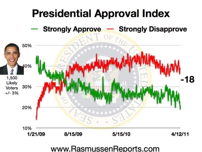
On the Rasmussen chart posted below, the red line represents voters who strongly disapprove of President Obama. The green line represents voters who strongly approve of President Obama. You can see the number strongly disproving peaked last year is is holding around 40%. However, the number strongly approving is still in decline. This represents the disillusionment of Obama's base?

No comments:
Post a Comment